Best Countertop Colors for Granbury Kitchens: Light vs Dark Choices for Cabinets, Flooring, and Resale Value
Choosing a countertop color sounds simple until you start comparing samples next to cabinets, flooring, backsplash tile, and paint. What looks perfect under showroom lighting can feel completely different once it is placed in a real kitchen.
For Granbury homeowners, countertop color often comes down to three big questions. Do you want the kitchen to feel brighter or richer? Do you want the counters to blend in or stand out? And how much does resale value matter in the decision?
At Countertops & Floors in Granbury, we help homeowners compare countertop colors in person so they can see how light, pattern, and finish work together. If your counters are part of a bigger kitchen update, our Granbury kitchen remodeling experts can help you coordinate cabinets, flooring, backsplash choices, and layout details before you commit.
Why countertop color matters more than most homeowners expect
Countertops take up a lot of visual space. They run along the perimeter, anchor the island, and sit directly against cabinets and walls. Because of that, the color you choose affects:
- How large or small the kitchen feels
- How bright or moody the room reads
- How much daily dust, crumbs, and water spots show
- Whether the kitchen feels timeless or trend-driven
- How easily the counters work with the rest of the home
A color choice that looks beautiful on its own still needs to make sense with the rest of the room.
Light countertop colors: when they work best
Light countertops are popular for good reason. They can make a kitchen feel more open, airy, and refreshed. In Granbury homes with medium or darker cabinetry, light counters can create contrast that keeps the room from feeling heavy.
Common reasons homeowners choose light counters:
- They brighten kitchens with limited natural light
- They pair well with white, warm wood, greige, and soft blue cabinets
- They tend to support a broad range of design styles, from farmhouse to modern
- They often appeal to future buyers because the look feels versatile
Light countertops can be especially helpful in kitchens where the island, backsplash, or flooring already has a lot of visual weight.
That said, not all light counters feel the same. A clean bright white reads very differently from a creamy off-white, warm beige, or soft gray with movement.
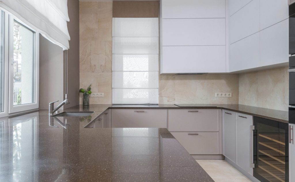
Dark countertop colors: where they shine
Dark countertops can make a kitchen feel grounded, dramatic, and more custom. They are often chosen for islands, rich cabinet colors, or kitchens where the homeowner wants more contrast and personality.
Why homeowners go dark:
- Dark counters can create a strong focal point
- They pair well with lighter cabinets for high contrast
- They can feel sophisticated in kitchens with brass, black, or mixed-metal hardware
- Some darker stones and surfaces hide certain types of staining or heavy patterning well
Dark countertops are especially effective when the kitchen has enough lighting to keep the room from feeling closed in. They can also work well on an island while lighter counters are used on the perimeter.
One thing to remember is that some dark polished surfaces show dust, fingerprints, and water spots more than homeowners expect. That does not make them a bad choice, but it does mean lifestyle should be part of the decision.
Matching countertop color to cabinet color
Countertops and cabinets should work as a pair, not as separate decisions.
A few practical combinations:
- White or light-painted cabinets: Almost any countertop color can work, but the overall feel changes a lot. Light counters keep things soft and bright. Dark counters make the contrast stronger and more dramatic.
- Medium wood cabinets: Warm whites, creams, taupes, and some deeper charcoals can all work depending on the floor and wall color.
- Dark cabinets: Light counters usually help balance the room and keep it from feeling too heavy.
- Color cabinets like sage, navy, or black: Countertop undertones matter. Cool counters can sharpen the look, while warmer tones can soften it.
The key is to watch undertones. A countertop that is technically “white” can still lean warm, cool, gray, cream, or even slightly green depending on the slab or pattern.
Matching countertop color to flooring and backsplash
Cabinets get most of the attention in countertop planning, but flooring and backsplash have just as much influence on whether the kitchen feels pulled together.
When flooring is warm:
- Warm whites, taupes, beige-based grays, and some soft black counters often fit better than icy whites
When flooring is cool:
- Crisp whites, cooler grays, and charcoal tones can feel more natural
When the backsplash is bold:
- A quieter countertop color often keeps the room balanced
When the backsplash is simple:
- The countertop can take on more visual interest and movement
If you are still narrowing backsplash direction, this guide on choosing the right backsplash tile for style and maintenance can help you avoid combinations that fight each other visually.
Light vs dark for resale value
Resale value does not mean chasing whatever is trendy for six months. It usually means choosing something broadly appealing, easy to live with, and flexible enough for the next homeowner.
In many kitchens, lighter neutral counters tend to feel safest for resale because they:
- Make the room look brighter
- Work with a wide range of cabinet colors
- Feel clean and adaptable in listing photos
- Blend with both modern and traditional finishes
That said, dark countertops can still support resale if the overall kitchen is balanced and the finish choices feel intentional. A dramatic island, for example, can add style without making the whole kitchen feel too specific.
If the remodel budget is part of your decision, this Granbury kitchen remodel cost guide can help you think about where countertop upgrades fit into the larger kitchen plan.
How daily life should influence color choice
A countertop does not live in a showroom. It lives in a real kitchen with groceries, spills, cooking messes, and everyday traffic.
Questions worth asking:
- Do you want a surface that hides crumbs between cleanings?
- Do you cook often with oils, sauces, or baking ingredients?
- Will the island be a homework, snack, and entertaining zone?
- Do you want the counters to be the visual feature or the supporting element?
Some homeowners are happiest with lighter counters because the whole kitchen feels fresher. Others prefer darker or more patterned counters because they hide visual clutter better in the middle of a busy week.
There is no single correct answer, only the best fit for how you live.
A practical way to narrow the decision
If you are stuck between light and dark, simplify the process.
Try this approach:
- Look at your cabinet color first
- Decide whether you want contrast or harmony
- Compare the countertop next to flooring, not by itself
- Look at the sample in morning light and evening light
- Think about maintenance, not just appearance
- Narrow to two or three realistic options and compare them side by side
This is often the fastest way to move from “everything looks good” to “this one actually fits the kitchen.”
Next steps
The best countertop color for a Granbury kitchen is the one that works with your cabinets, flooring, lighting, and day-to-day habits, while still giving the room the feel you want. Light counters can open a kitchen up. Dark counters can add depth and contrast. Both can work well when the surrounding finishes support the choice.
If you are ready to compare countertop colors in person, visit our showroom at 300 Temple Hall Hwy, Granbury, TX 76049 or call 817-962-2657. We can help you narrow the options and match them to your kitchen goals before you make a final decision.